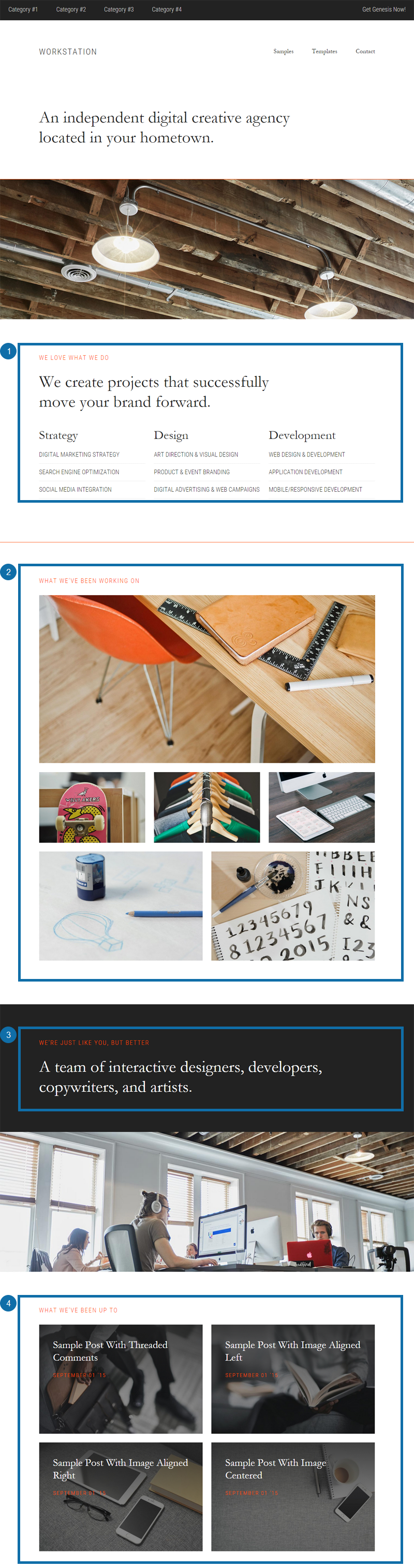
You may wish to have the Workstation Pro theme demo open for reference while setting up your theme.
The setup documentation for this theme has been broken down into the following sections:
- Customize Your Settings
- Genesis Theme Settings
- Site Identity
- Front Page Background Images
- Color Settings
- Custom Header Image
- Navigation Menus
- Front Page Setup
- Front Page Layout
- Front Page & Flexible Footer Layout Configurations
- Front Page 1 Widget Area
- Front Page 2 Widget Area
- Front Page 3 Widget Area
- Front Page 4 Widget Area
- Widget Areas
- Primary Sidebar
- After Entry Widget Area
- Contact Page Sidebar
- Flexible Footer Widget Area
- Widgets
- Add a Widget to a Widget Area
- Genesis User Profile Widget Settings
- Genesis Featured Page Widget Settings
- Genesis Featured Posts Widget Settings
- Recent Comments Widget Settings
- Tag Cloud Widget Settings
- Text Widget Settings
- Page Templates
- Blog Page Template
- Archive Page Template
- Landing Page Template
- Extras
- Page Excerpts
- Background Color for Site Header and Page Excerpt Area
- Column Classes
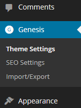
Genesis Theme Settings
Accessing The Genesis Theme Settings
The Genesis Theme Settings allow you to configure the settings for features like the content archives and default theme layout.
To access the theme settings, go to Genesis > Theme Settings in your WordPress dashboard.
Genesis Theme Settings Overview
The Genesis Theme settings screen contains a number of Genesis Specific options.
- Information – Displays information and update notification options for the Genesis Framework.
- Custom Feeds – Allows you to redirect your RSS feed URLs if you’re using a feed delivery service.
- Default Layout – Determines site-wide layout for posts, pages, and archive views. The theme may override this setting for the home page and alternative settings can be used on a per page, post, or archive basis.
- Navigation – When a WordPress Menu has been previously created, the option to display “Navigation Extras” on the Primary navigation area will display here.
- Breadcrumbs – Breadcrumbs can be configured to display on different content types to guide visitors back, incrementally, to your home page.
- Comments and Trackbacks – Comments and Trackbacks can be completely disabled for Posts or Pages. Existing Comments and Trackbacks will continue to display. This is a global setting and cannot be overridden at the post or page level.
- Content Archives – Controls the display options for Date, Category, Tag, Taxonomy, and Author archive views.
- Blog Page Template – Controls the display options for Pages using the Blog Page Template.
- Header and Footer Scripts – Add site-wide scripts to the header or footer of your site. Often used for statistical tracking scripts from third party services.
Specific settings for the Workstation Pro Theme are outlined in more detail below.
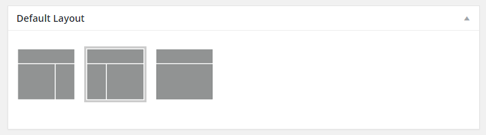
How To Configure The Default Page Layout
The Workstation Theme uses the Sidebar-Content Layout option in the theme demo for all site pages.
The default page layout of Sidebar-Content will be set by default when the Workstation Theme is activated.
An alternative Default Layout can be selected from the available options shown below:
How To Configure The Content Archives
The following defaults will be set upon activation of the Workstation theme:
- For Content Archives, the default setting of Display post content is used by the demo.
- Limit content to __ characters: Leave the field blank, or set it to 0.
- Include the Featured Image: Check the box to display the featured image.
- Image Size: Select featured-content-lg (1200 x 600).
- Image Alignment: Select None.
- Post Navigation Technique: Select Numeric in the drop down box.
You can adjust these options as desired.
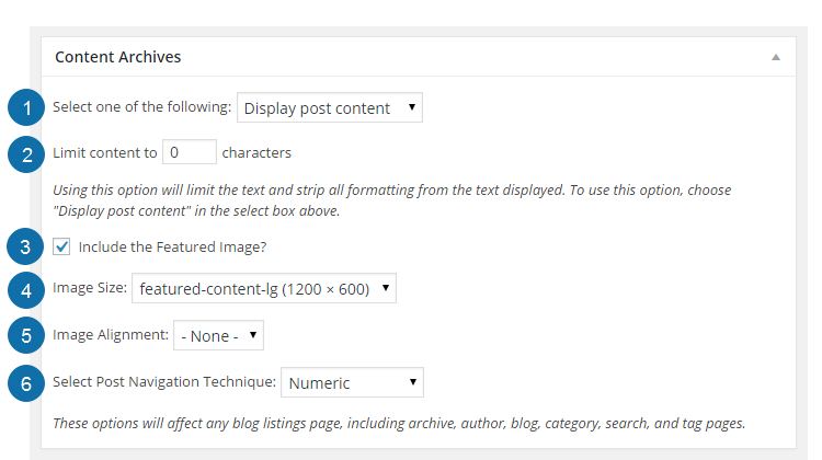
Be sure to click the Save Settings button to preserve your changes.
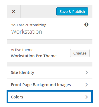
Site Identity
The site title, tagline and site icon for your site can be set by going to Appearance > Customize.
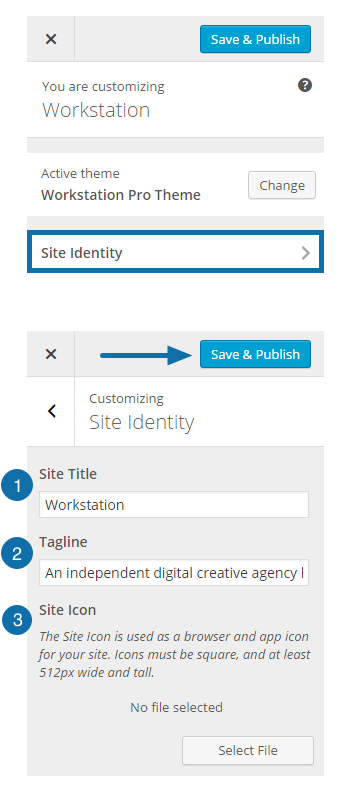
- The Site Title will display in the header of your site.
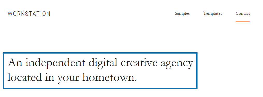
- The Tagline will be displayed below the header on the front page of your site (as shown in the image below).
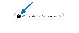
- The Site Icon (or favicon) will be displayed in the browser tab when viewing your site. Click Select File to upload your site icon (as shown in the image below).
Be sure to click the Save and Publish button to preserve your changes.
Workstation Pro Tagline
Site Icon (Favicon)
Front Page Background Images
The Workstation Pro theme includes images which display as background images in two areas of the front page. The first background image is displayed beneath the site header and tagline. The second background image is displayed beneath the Front Page 3 widget area.
If you prefer to use different images, you can go to Appearance > Customize > Front Page Background Images. A thumbnail sized version of the default, preloaded images will be displayed.
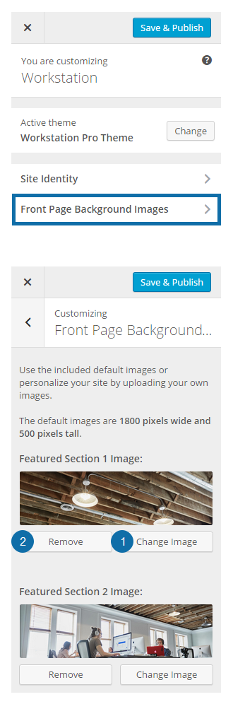
- To set an alternate image in this area click Change Image button underneath the image. A popup will display allowing you to upload the image of your choice using your computer’s file navigation tool, or to find one directly in your Media Library.
- If desired, you can remove the image by clicking the Remove button.
If you choose to remove the image, you may return to the default image by clicking the Default button (as shown below).
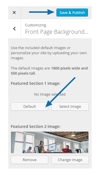
Be sure to click the Save & Publish button to preserve your changes.
Notes:
- The Workstation Pro theme demo uses a 1800×500 pixel image for the each of the Front Page Background Images.
- Your Front Page Background images don’t need to be a specific size – the theme is responsive and will crop, shrink, and grow the image as needed.
- However, due to the nature of the effect applied to these Front Page Background Images, not all images will look correct. Images designed to serve as a backdrop will work best.
Color Settings
The Workstation Pro theme comes with the option to change the color of some elements used within the theme.
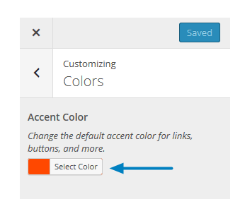
An Accent Color can be set to display a color of your choice for the links, numeric pagination, highlighted menu items, and the header area background for posts or pages that are using the .add-color body class.
Be sure to click the Save & Publish button at the top of the customizer to preserve your changes.
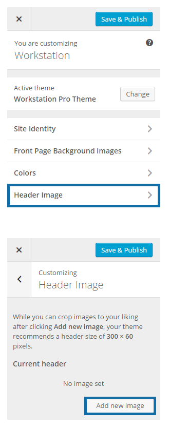
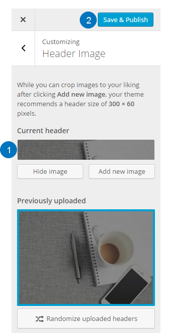
Custom Header Image
Uploading a New Header Image
If you prefer a Logo Image rather than a text-based Site Title, it is possible to use a small logo image that will display in the header of the site.
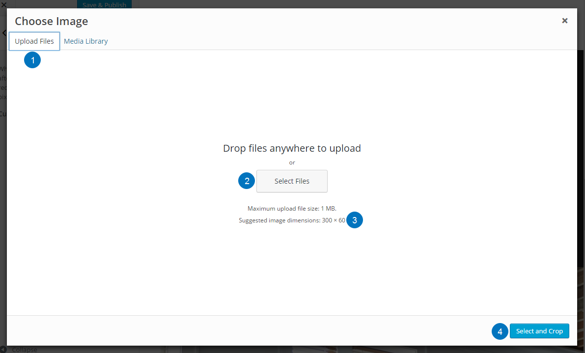
- Go to Appearance > Customize > Header Image in your WordPress admin panel.
- Click Add New Image and navigate to the image you would like to use for a Logo.
Note: Images of exactly 300×60 pixels will give the best results. Other sizes will be cropped in the upload process to create an image of the correct size.
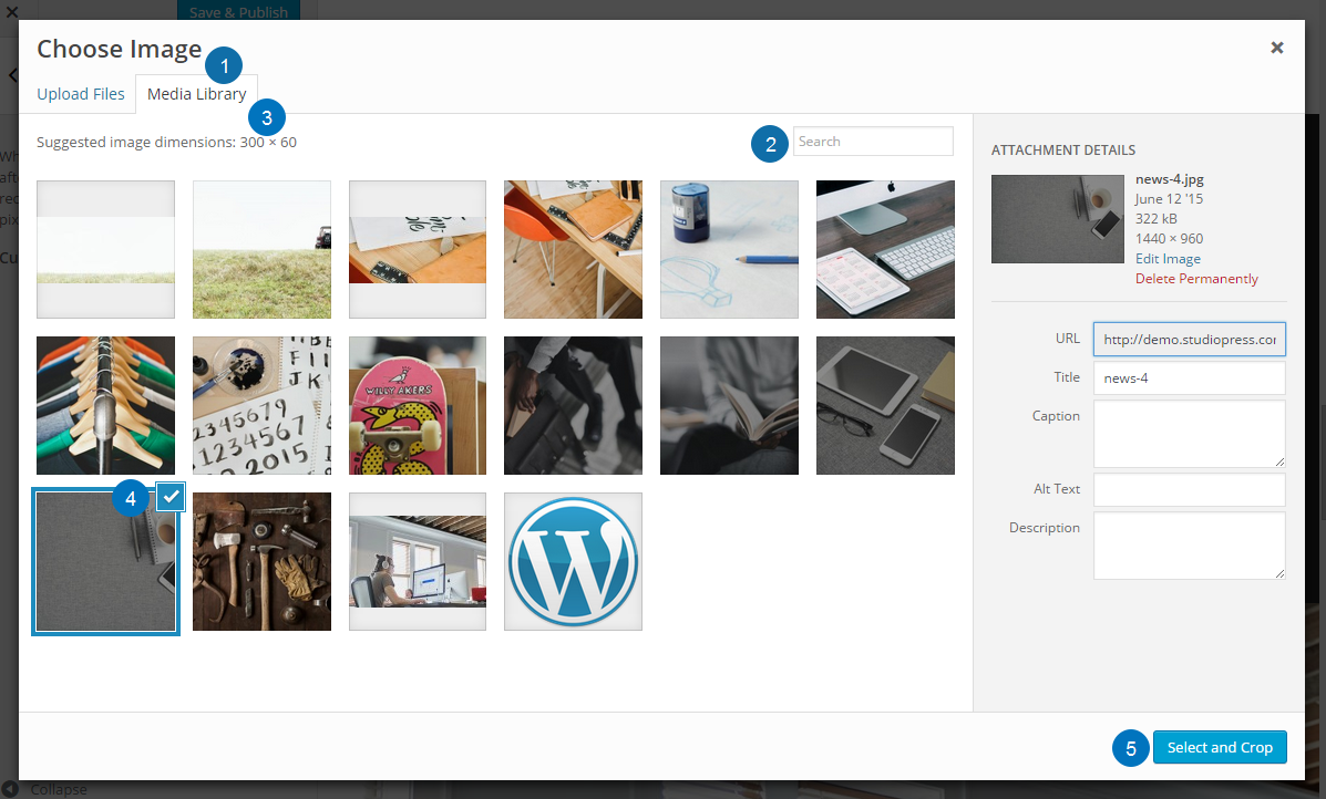
Selecting an Image from the Media Library
- Click the Media Library tab to display a selection of previously uploaded images.
- If the image you wish to use is not visible on this page use the search box to help locate the image.
- The final size of the image that will be used in your header will display. Images of the exact size shown here will work best. Images that are not these dimensions will be resized and/or cropped in order to fit the size set for your theme.
- Select the image from those shown by clicking on the image. A blue square indicator with a checkmark will display in the upper right corner of the selected image.
- Click Select and Crop
Uploading a New Custom Header Image
- Click the Upload Files tab to display the option to upload an image for use as a Header Image.
- Drag images from your computer’s file manager onto the white area of this screen OR click Select Files.
- The final size of the image that will be used in your header will display. Images of the exact size shown here will work best. Images that are not these dimensions will be resized and/or cropped in order to fit the size set for your theme.
- Click Select and Crop
Cropping the Image
If your image is different dimensions than the suggested size, you may be asked to crop the image.
- Select the portion of the image you would like to use as your header.
- Click Crop Image.
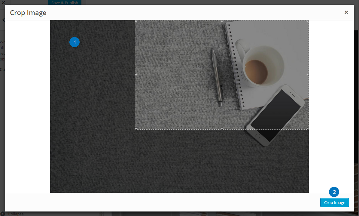
- The image will be shown on the customize screen.
- Make sure to click Save & Publish to update your site.
Navigation Menus
The Workstation theme includes a Header Navigation menu area and a Before Header Navigation menu area.
- The Header Navigation menu will display in the site header next to the site title or header image.
- The Before Header Navigation menu will display above the site header. The theme demo does not use the Before Header Navigation menu area.
Manage Menu Locations
Go to Appearance > Menus and create your menus. Add your menu items and then save the menu.
The default navigation areas can be enabled or disabled under Appearance > Menus > Manage Locations.
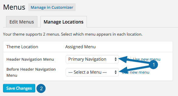
- Use the drop downs to select a menu you created. To disable the Navigation Menu locations, set the Header and Before Header Navigation Menus to the Select a Menu option in the drop downs.
- Be sure to click the Save Changes button to preserve your changes.
Align a Menu Item to the Right
The Workstation theme includes the option to display a menu item on the right side of the Before Header Navigation Menu.

Access More Options
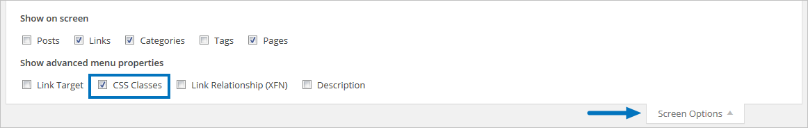
To display a menu item on the right, you’ll need to add a CSS Class to the menu item under Appearance > Menus.
- Click Screen Options in the upper right corner of the Menus page to show more options for your menu items.
- Check the box for CSS Classes.
Add CSS Class to Your Menu Item
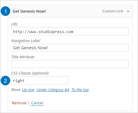
- Click the menu item you would like to highlight to view the available options.
- Add “right” to the CSS Classes field (without quotes).
Be sure to Save your menu once you’ve added the class to your desired menu item.
Front Page Layout
The Workstation Pro front (home) page is configured with several widget areas:
- Front Page 1: A full-width widget area with four (4) Text widgets configured to display text and lists.
- Front Page 2: A full-width widget area with six (6) Genesis – Featured Page widgets configured to display the featured image of selected pages.
- Front Page 3: A full-width widget area with one (1) Text widget configured to display general text.
- Front Page 4: A full-width widget area with one (1) Genesis – Featured Posts configured to display the latest blog posts.
Note: If no widget areas are active in any of the front page specific widget areas, a blog-style front page will be displayed. If you wish to use a static page set under Settings > Reading for your front page, do not add widgets to the front page widget areas, since doing this will override the static page.
Front Page & Flexible Footer Layout Configurations
The front page and flexible footer widget areas are designed to change layout based on the number of widgets added to these areas. The image below illustrates the different layouts based on the number of widgets used.
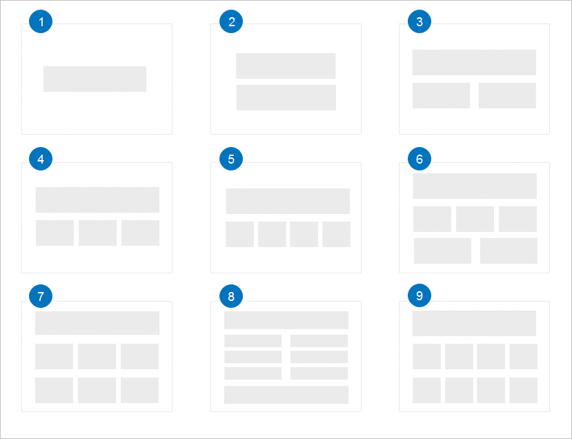
- One widget displays a single full-width row.
- Two widgets will display as two (2) full-width rows.
- Three widgets will display as two (2) rows. The first row will display full width. The second row will display as two (2) columns equal to approximately one-half the width of the widget area.
- Four widgets will display as two (2) rows. The first row will display full width. The second row will display as three (3) columns equal to approximately one-third the width of the widget area.
- Five widgets will display as two (2) rows. The first row will display full-width. The second row will display as four (4) columns equal to approximately one-quarter the width of the widget area.
- Six widgets will display as three rows. The first and last row will display as full-width. The middle row will display as three (3) columns equal to approximately one-third the width of the widget area.
- Seven widgets will display as three rows. The first row will display full-width. The second and third rows will display as three (3) columns equal to approximately one-third the width of the widget area.
- Eight widgets will display as five (5) rows. The first and last row will display as full-width. The middle three (3) rows will display as two (2) columns equal to approximately one-half the width of the widget area.
- Nine widgets will display as three rows. The first row will display full-width. The second and third rows will display as four (4) columns equal to approximately one-quarter the width of the widget area.
Additional widgets will display in similar configurations to those above.
The Workstation Pro theme demo displays the following number of widgets in the home page and flexible footer widget areas.
- Front Page 1 widget area uses four (4) widgets.
- Front Page 2 widget area uses six (6) widgets.
- Front Page 3 widget area uses one (1) widget.
- Front Page 4 widget area uses one (1) widget.
- Flexible Footer widget area uses four (4) widgets.
Front Page 1 Widget Area
The Front Page 1 widget area in the Workstation Pro theme demo uses four (4) Text widgets to display text and lists.
The theme demo uses the following content in these text widgets, but you may use whatever message you wish.
Go to Appearance > Widgets to add Text widgets to this area.
To configure each widget, click on the title bar to open it and change the settings as desired:
First Text Widget
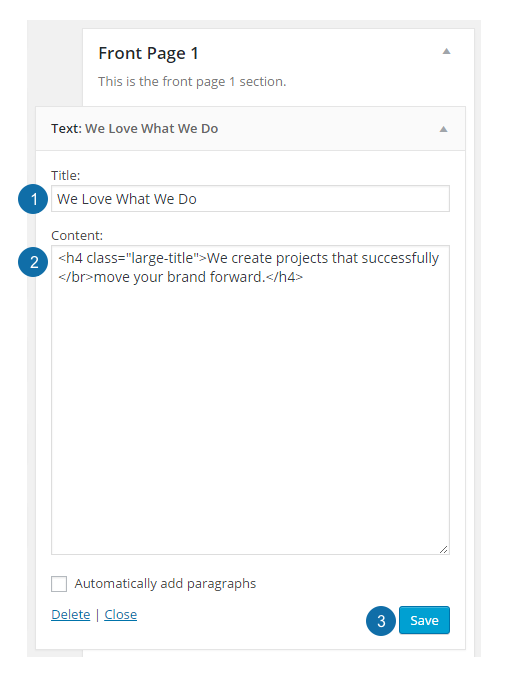
- Title: The widget title is the small title text at the top of this widget.
- Content: The demo uses HTML to create a larger title which is displayed under the widget title.
- Click Save to preserve your settings.
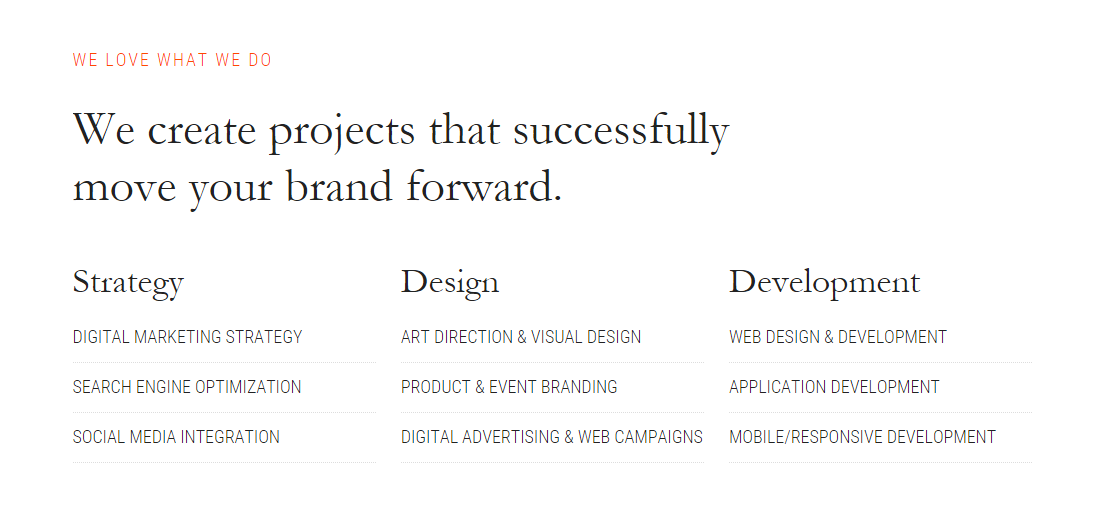
The Workstation Pro theme demo uses the following content in the first Text widget:
| <h4 class=“large-title“>We create projects that successfully </br>move your brand forward.</h4> |
Second Text Widget
- Content: The demo uses HTML to create a title and an unordered list to highlight services offered.
- Click Save to preserve your settings.
The Workstation Pro theme demo uses the following content in the second Text widget:
| <h4 class=“small-title“>Strategy</h4> | |
| <ul class=“list“> | |
| <li>Digital Marketing Strategy</li> | |
| <li>Search Engine Optimization</li> | |
| <li>Social media Integration</li> | |
| </ul> |
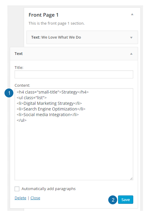
Third Text Widget

- Content: The demo uses HTML to create a title and an unordered list to highlight services offered.
- Click Save to preserve your settings.
The Workstation Pro theme demo uses the following content in the third Text widget:
| <h4 class=“small-title“>Design</h4> | |
| <ul class=“list“> | |
| <li>Art Direction & Visual Design</li> | |
| <li>Product & Event Branding</li> | |
| <li>Digital Advertising & Web Campaigns</li> | |
| </ul> |
Fourth Text Widget
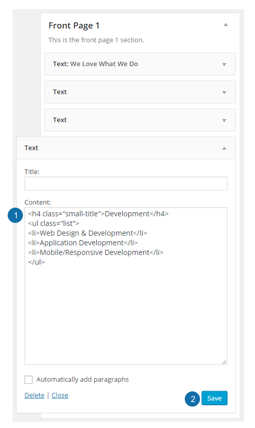
- Content: The demo uses HTML to create a title and an unordered list to highlight services offered.
- Click Save to preserve your settings.
The Workstation Pro theme demo uses the following content in the fourth Text widget:
| <h4 class=“small-title“>Development</h4> |
| <ul class=“list“> |
| <li>Web Design & Development</li> |
| <li>Application Development</li> |
| <li>Mobile/Responsive Development</li> |
| </ul> |
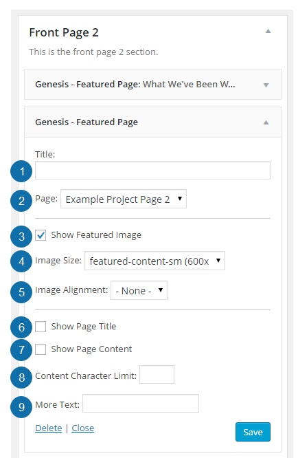
Front Page 2 Widget Area
The Front Page 2 widget area in the Workstation Pro theme demo uses six (6) Genesis – Featured Page widgets to display featured projects, but you may use any content you wish.
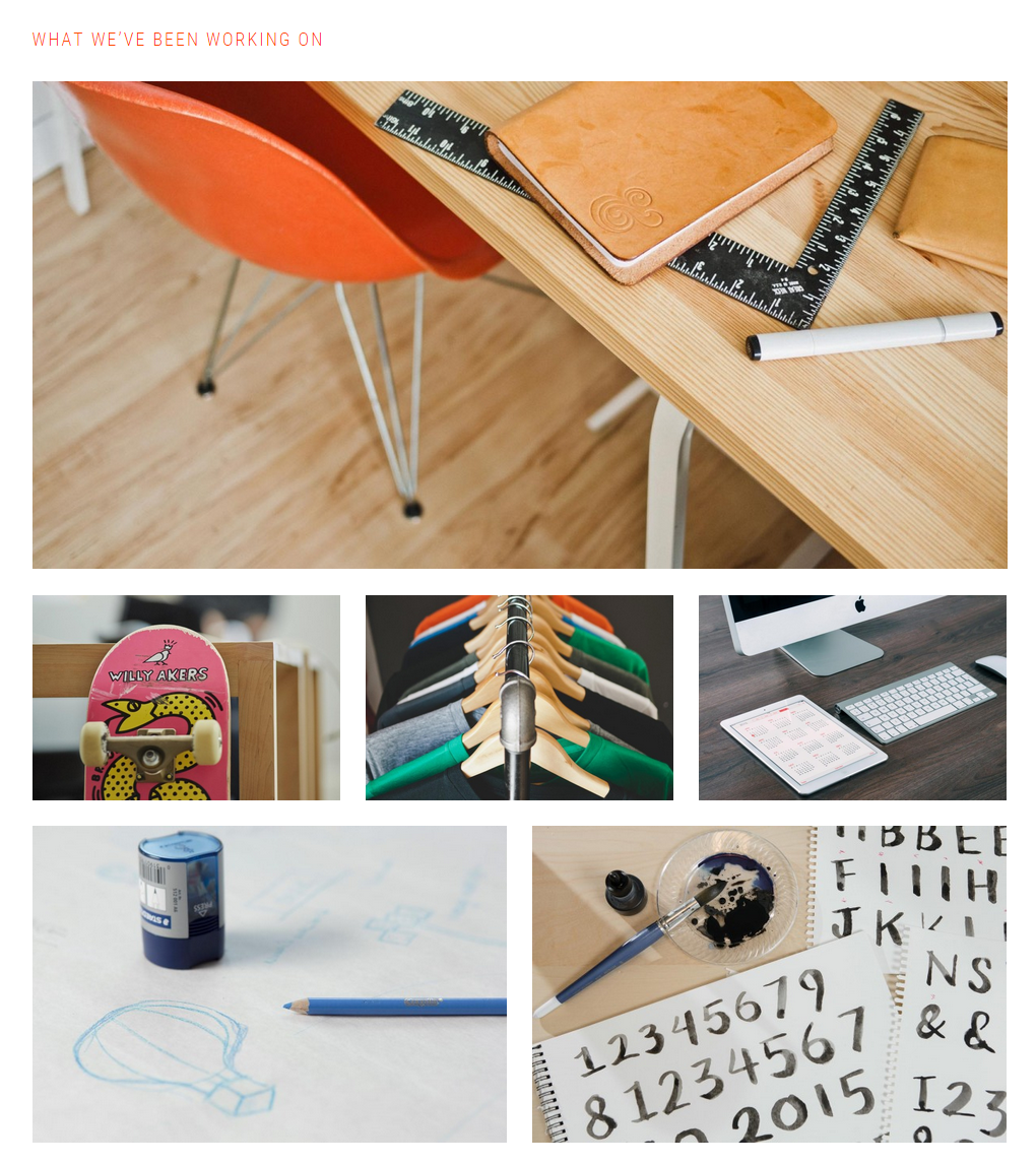
Go to Appearance > Widgets to add Genesis – Featured Page widgets to this area.
To configure the widgets, click on the title bars to open them and change the settings as desired:
First Featured Page Widget

- Title: Use a title of your choice to describe the page being featured.
- Page: Select the page you wish to have displayed from the drop down.
- Show Featured Image: Check the box to display a featured image.
- Image Size: Select the size of the featured image.
- Image Alignment: Select the image alignment (Left, Right, Center or None).
- Show Page Title: Check the box to display the page title beneath the featured image.
- Show Page Content: Check the box to display the content of the featured page.
- Content Character Limit: Enter the number of characters you’d like to display. Leave blank to display all the text from the page. Enter a number if you’d like to display only an excerpt of the page.
- More Text: If you have entered a character limit above, enter the text you’d like to display in the more link. This text will automatically link to the featured page.
Once you have completed the widget configuration, be sure to click Save at the bottom of the widget to preserve your settings.
Remaining Featured Page Widgets
- Title: The Workstation Pro theme demo does not use the title in the remaining Featured Page widgets in this section.
- Page: Select the page you wish to have displayed from the drop down.
- Show Featured Image: Check the box to display a featured image.
- Image Size: Select the size of the featured image.
- Image Alignment: Select the image alignment (Left, Right, Center or None).
- Show Page Title: Check the box to display the page title beneath the featured image.
- Show Page Content: Check the box to display the content of the featured page.
- Content Character Limit: Enter the number of characters you’d like to display. Leave blank to display all the text from the page. Enter a number if you’d like to display only an excerpt of the page.
- More Text: If you have entered a character limit above, enter the text you’d like to display in the more link. This text will automatically link to the featured page.
Once you have completed the widget configuration, be sure to click Save at the bottom of the widget to preserve your settings.
Front Page 3 Widget Area
The Front Page 3 widget area in the Workstation Pro theme demo uses a Text widget to display a title and text, but you may use any content you wish.

Go to Appearance > Widgets to add a Text widget to this area.
To configure the widget, click on the title bar to open it and change the settings as desired:
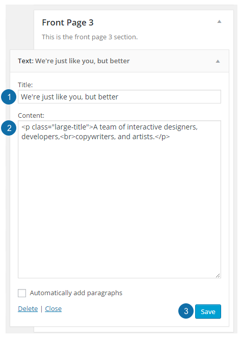
- Title: The widget title is the small title text at the top of this widget.
- Content: The demo uses HTML to create a larger title which is displayed under the widget title.
- Click Save to preserve your settings.
The Workstation Pro theme demo uses the following content in the Text widget:
| <p class=“large-title“>A team of interactive designers, developers,<br>copywriters, and artists.</p> |
Front Page 4 Widget Area
The Front Page 4 widget area in the Workstation Pro theme demo uses one (1) Genesis – Featured Posts widget to display the latest blog posts.
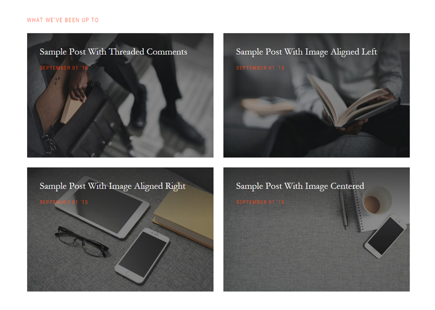
Go to Appearance > Widgets to add a Genesis – Featured Posts widget to the Front Page 4 Widget area.
To configure the widgets, click the title bar to open if necessary, then change the settings as desired.
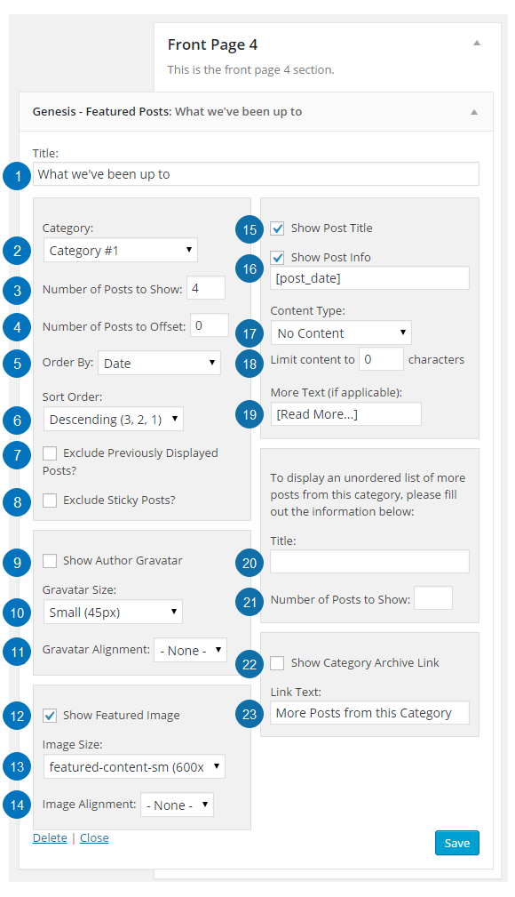
- Title: Enter the title you wish to display for this widget, such as What we’ve been up to.
- Category: Select which category you’d like to feature.
- Number of Posts to Show: Enter the number of posts you’d like to display in this area.
- Number of Posts to Offset: Enter the number of posts to offset (or skip). Offset is used when you have Featured Posts appearing elsewhere and you don’t want to repeat posts in those areas. Offsetting by 1 will show the next most recent post.
- Order by: Select the order in which the posts should be displayed.
- Sort Order: Select whether the order should be descending or ascending.
- Exclude Previously Displayed Posts?: Check the box to exclude posts that have already been displayed. This is useful when a post has been assigned to more than one category.
- Exclude Sticky Posts: Check the box to prevent sticky posts from being displayed.
- Show Author Gravatar: Check to display the post author’s gravatar.
- Gravatar Size: Select the size of the gravatar to display.
- Gravatar Alignment: Select the gravatar image alignment (Left, Right or None).
- Show Featured Image: Check the box to enable the featured image.
- Image Size: Select the desired image size for your featured image.
- Image Alignment: Select the image alignment (Left, Right, Center or None). Note: Select None to allow the post title and date to overlay the featured image.
- Show Post Title: Check the box to display the featured post title under the featured image.
- Show Post Info: Check the box to display the post info including the post date, author and comment link. You can then customize as desired.
- Content Type: Choose whether to display the Excerpt, Content, a Content Limit or No Content. Note: The theme demo is using a custom excerpt to display the content. See below for details.
- Limit Content: If you choose to display a Content Limit, enter the number of characters to display.
- More Text (if applicable): If you choose to display a Content Limit, enter the desired more text, such as [Read More…]. This text will automatically be linked to the post.
- Title: If you would like to display an unordered list of more posts from the selected category, you may add a Title, for example More Posts from this Category.
- Number of Posts to Show: If you would like to display an unordered list of more posts from the selected category, enter the number of posts to show.
- Show Category Archive Link: If you have selected a single category to display in this widget, check the box to display a link to the rest of the posts in this category. Note: If you have the widget set to show All Categories, this link will not be displayed.
- Link Text: Enter the text you’d like to display in the link, for example More Posts from this Category.
Once you have completed the widget configuration, be sure to click Save at the bottom of the widget to preserve your settings.
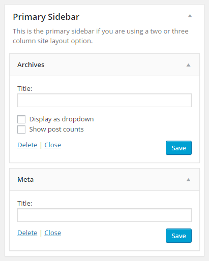
Primary Sidebar
The Workstation Pro theme demo uses an Archives and Meta widget in Primary Sidebar widget area.
You may use any widgets you like in this area.
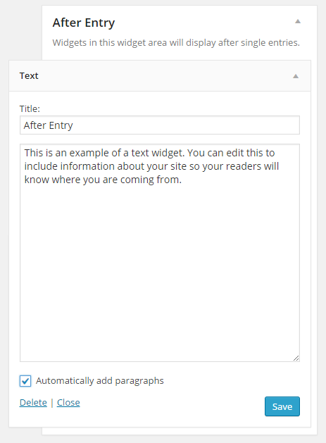
After Entry Widget Area
The Workstation Pro theme includes an After Entry widget area that displays after the Post Content and before Comments on Single Posts. The theme demo does not utilize this widget area.
Go to Appearance > Widgets to add widgets to the After Entry widget area.
You can use any widget of your choice. Here’s an example showing a Text widget added to this area:
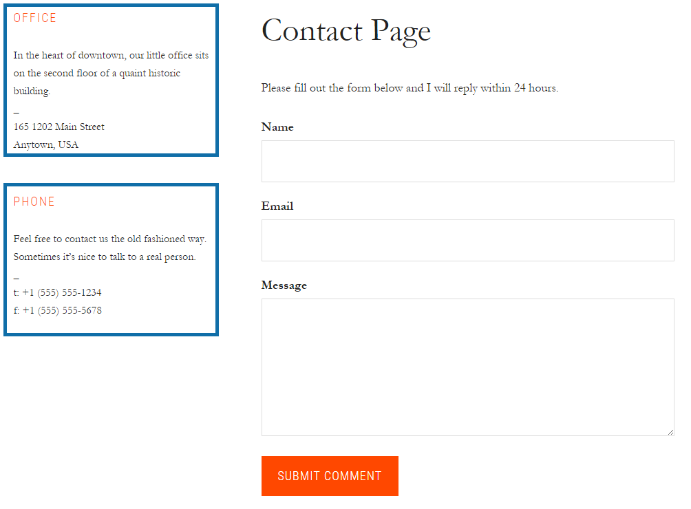
Contact Page Sidebar
The Workstation Pro theme demo uses the Genesis Simple Sidebars plugin to create a Contact Sidebar widget area. This allows you to display unique content in this area that is separate from the content displayed in the Primary Sidebar area.
The demo uses two (2) Text widgets in the Contact Sidebar widget area.
You may use any widgets you like in this area.
Create a New Sidebar
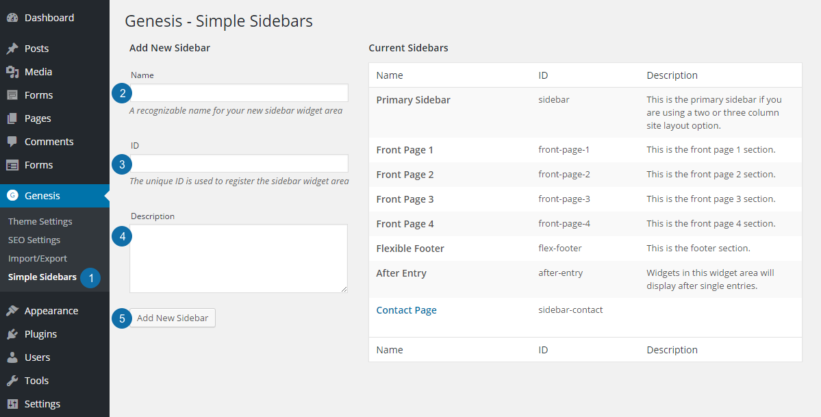
After installing and activating the Genesis Simple Sidebars plugin, follow these steps to create your new sidebar:
- Go to Genesis > Simple Sidebars to access the Genesis – Simple Sidebars screen.
- Name: Type the name of your new sidebar. This name is for your reference only. The Workstation Pro theme demo uses Contact Page.
- ID: Type a unique ID for this sidebar. This ID registers (or creates) the sidebar. Use lowercase letters and numbers and use dashes instead of spaces. The Workstation Pro theme demo uses sidebar-contact.
- Description: Add a description to help you remember where this sidebar will be displayed (optional).
- Click Add New Sidebar to preserve your settings.
Connect the New Sidebar to a Page
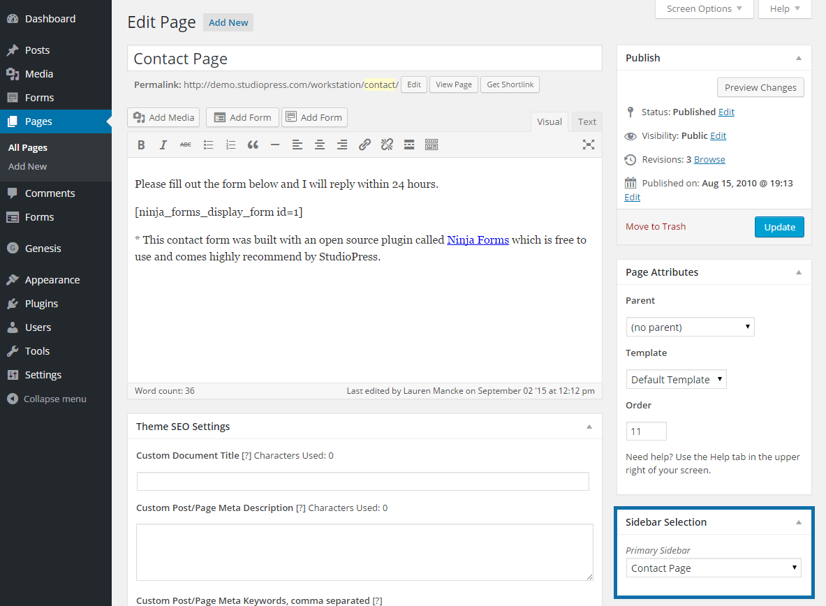
Go to Pages > Add New to create a new page or Pages > View All to edit an existing page. Select the sidebar you just created in the Sidebar Selection widget on the right side of the page.
Click Publish or Update to preserve your settings.
Add Widgets to the New Sidebar
Go to Appearance > Widgets to add Text widgets to this area.
To configure each widget, click on the title bar to open it and change the settings as desired:
First Text Widget
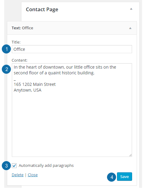
- Title: The widget title is the title text which appears at the top of this widget.
- Content: The demo uses general text which is displayed under the widget title.
- Automatically add paragraphs: Check the box to automatically format this content as paragraphs.
- Click Save to preserve your settings.
The Workstation Pro theme demo uses the following content in the first Text widget:
Second Text Widget
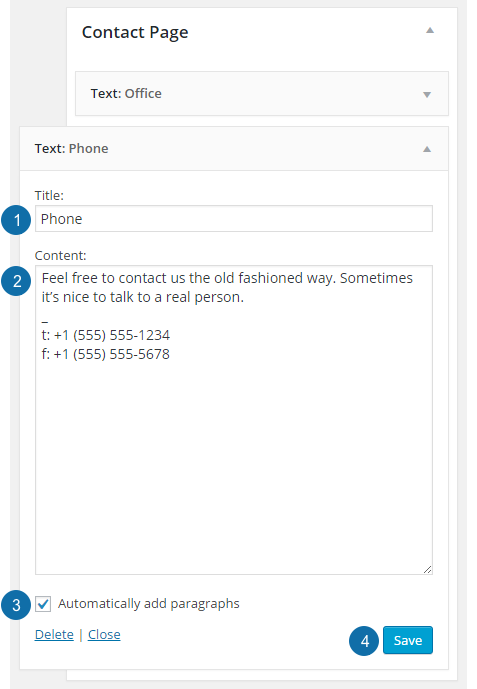
- Title: The widget title is the title text which appears at the top of this widget.
- Content: The demo uses general text which is displayed under the widget title.
- Automatically add paragraphs: Check the box to automatically format this content as paragraphs.
- Click Save to preserve your settings.
The Workstation Pro theme demo uses the following content in the second Text widget:
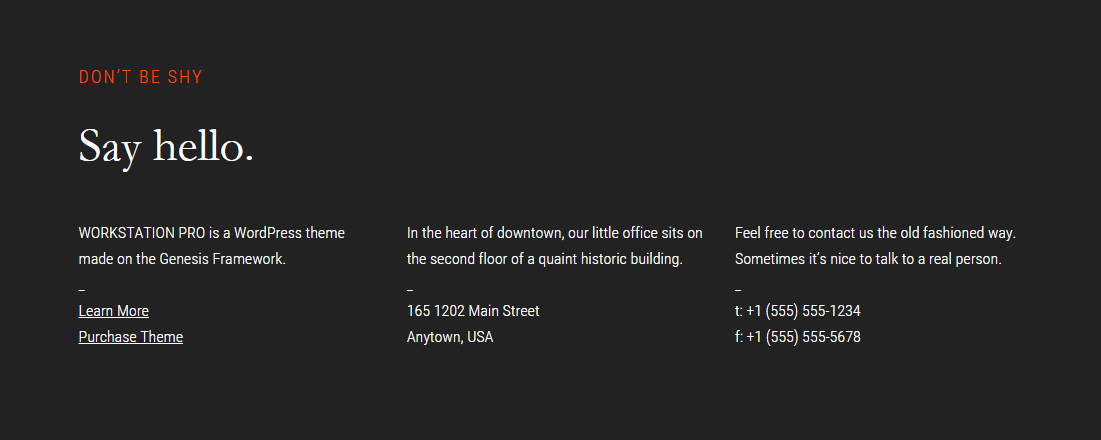
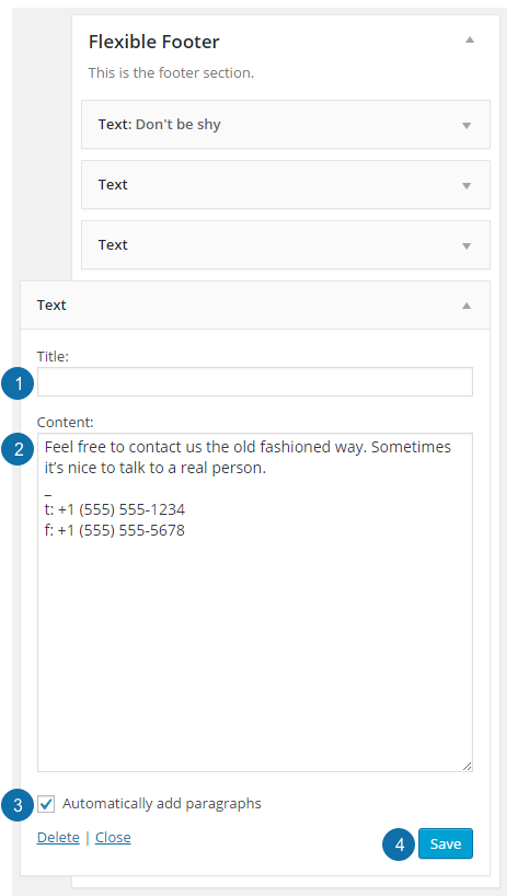
Flexible Footer Widget Area
The Flexible Footer widget area is designed to change layout based on the number of widgets added to these areas. The available layout configurations match what is available for the home page.
The Workstation Pro theme demo uses four (4) Text widgets to display content in this widget area, but you may use whatever content you wish.
Go to Appearance > Widgets to add Text widgets to this area.
To configure each widget, click on the title bar to open it and change the settings as desired:
First Text Widget
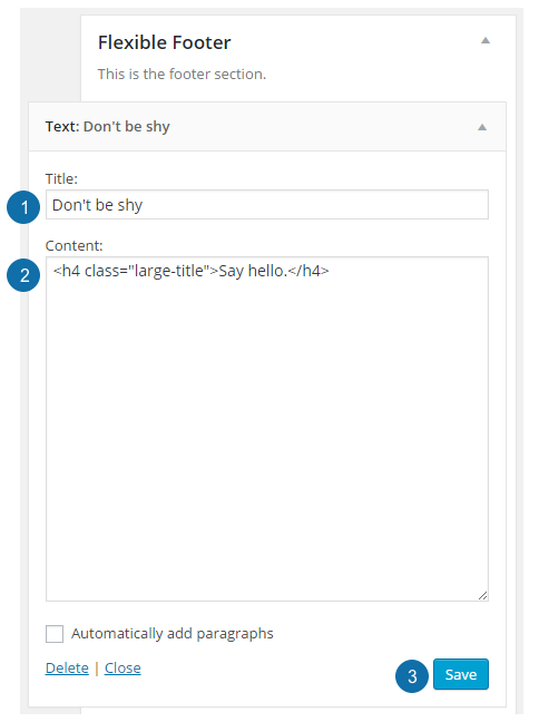
- Title: The widget title is the small title text at the top of this widget.
- Content: The demo uses HTML to create a larger <h1> title which is displayed under the widget title.
- Click Save to preserve your settings.
The Workstation Pro theme demo uses the following content in the first Text widget:
Second Text Widget
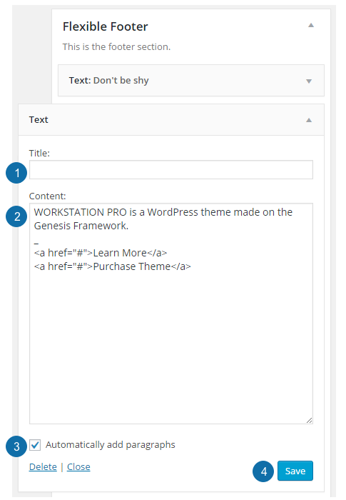
- Title: The widget title is not used in the demo.
- Content: The demo displays general text and uses HTML to create links.
- Automatically add paragraphs: Check the box to automatically format this content as paragraphs.
- Click Save to preserve your settings.
The Workstation Pro theme demo uses the following content in the second Text widget:
Third Text Widget
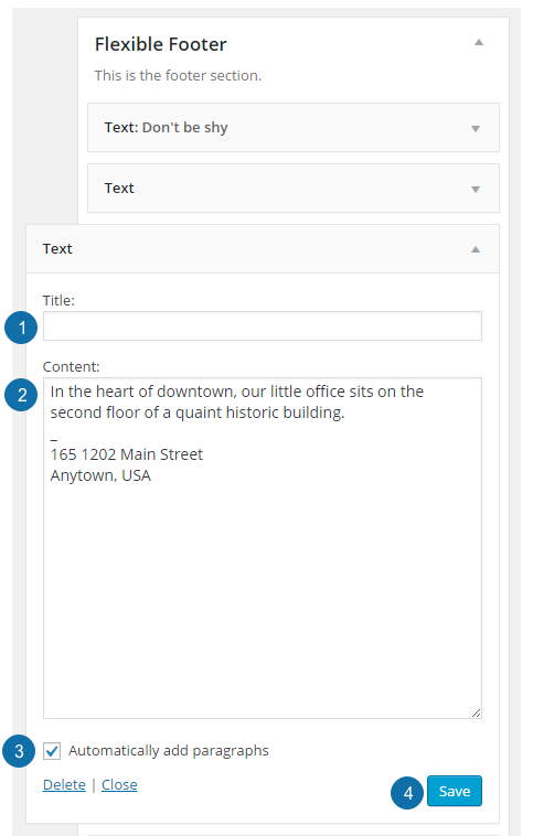
- Title: The widget title is not used in the demo.
- Content: The demo displays general text.
- Automatically add paragraphs: Check the box to automatically format this content as paragraphs.
- Click Save to preserve your settings.
The Workstation Pro theme demo uses the following content in the third Text widget:
Fourth Text Widget
- Title: The widget title is not used in the demo.
- Content: The demo displays general text.
- Automatically add paragraphs: Check the box to automatically format this content as paragraphs.
- Click Save to preserve your settings.
The Workstation Pro theme demo uses the following content in the fourth Text widget:
Add a Widget to a Widget Area
Go to Appearance > Widgets to add widgets to any widget area.
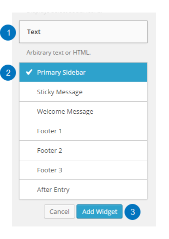
- Click on the widget title bar. This example is adding a Text widget, but you may use any widget you wish.
- Select the desired widget area from the list.
- Click Add Widget.
To configure the widget, click the title bar to open it if necessary, then change the settings as desired.
Once you are finished entering your content in the widget, be sure to click Save at the bottom of the widget to preserve your changes.
Genesis User Profile Widget Settings
The Genesis User Profile widget is used to display a user profile section. It can be used in any widget area, such as a sidebar or a footer.
To add the widget to an area, go to Appearance > Widgets, click on the Genesis User Profile widget title bar, select the desired widget area, and click Add Widget.
To configure the widget, click the title bar to open it, and change the settings to the following:
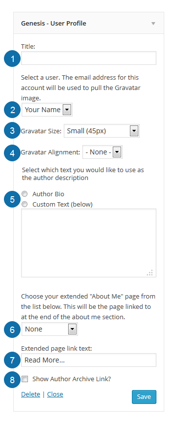
- Title: The title you wish to display, such as About Me or Profile.
- Select a user: Select the user account you wish to display the profile for.
- Gravatar Size: Select the desired image size for your Gravatar image.
- Gravatar Alignment: Select the image alignment (None, Left, or Right).
- Author Description: You may use the author bio text from your user profile, or you may add custom text in the box if you wish.
- Choose page dropdown: You may add a link to the end of the text to another page with more information, such as your About page.
- Extended page link text: The text you wish to use for the link.
- Show Author Archive Link: Check the box if you also wish to add a link to the user’s archive page.
Once you have completed the widget configuration, be sure to click Save at the bottom of the widget to preserve your settings.
Genesis Featured Page Widget Settings
The Genesis Featured Page widget is used to display a featured image and a page excerpt of a single page. It can be used in any widget area, such as a sidebar or a footer.
To add the widget to an area, go to Appearance > Widgets, click on the Genesis Featured Page widget title bar, select the desired widget area, and click Add Widget.
To configure the widget, click the title bar to open it, and change the settings to the following:
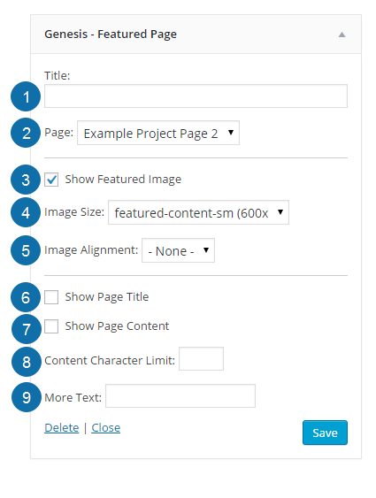
- Title: Enter the title you wish to display for this widget, such as Featured Page.
- Page: Use the drop down to select which page you’d like to feature.
- Show Featured Image: Check the box to enable the featured image.
- Image Size: Select the desired image size for your featured image.
- Image Alignment: Select the image alignment (None, Left, Right or Center).
- Show Page Title: Check the box to display the featured page title under the featured image.
- Show Page Content: Check the box to display the content from the featured page.
- Content Character Limit: Enter the number of characters to display in the widget.
- More Text: Enter the more text you’d like to use, such as Learn More. This text will automatically be linked to the featured page.
Once you have completed the widget configuration, be sure to click Save at the bottom of the widget to preserve your settings.
Genesis Featured Posts Widget Settings
The Genesis Featured Posts widget is used to display one or more blog posts and can be used to show featured images and excerpts of posts from selected categories. It can be used in any widget area, such as a sidebar or a footer.
To add the widget to an area, go to Appearance > Widgets, click on the Genesis Featured Posts widget title bar, select the desired widget area, and click Add Widget.
To configure the widget, click the title bar to open it, and change the settings to the following:
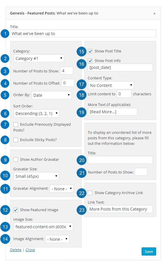
- Title: Enter the title you wish to display for this widget, such as What we’ve been up to.
- Category: Select which category you’d like to feature.
- Number of Posts to Show: Enter the number of posts you’d like to display in this area.
- Number of Posts to Offset: Enter the number of posts to offset (or skip). Offset is used when you have Featured Posts appearing elsewhere and you don’t want to repeat posts in those areas. Offsetting by 1 will show the next most recent post.
- Order by: Select the order in which the posts should be displayed.
- Sort Order: Select whether the order should be descending or ascending.
- Exclude Previously Displayed Posts?: Check the box to exclude posts that have already been displayed. This is useful when a post has been assigned to more than one category.
- Exclude Sticky Posts: Check the box to prevent sticky posts from being displayed.
- Show Author Gravatar: Check to display the post author’s gravatar.
- Gravatar Size: Select the size of the gravatar to display.
- Gravatar Alignment: Select the gravatar image alignment (Left, Right or None).
- Show Featured Image: Check the box to enable the featured image.
- Image Size: Select the desired image size for your featured image.
- Image Alignment: Select the image alignment (Left, Right, Center or None).
- Show Post Title: Check the box to display the featured post title under the featured image.
- Show Post Info: Check the box to display the post info including the post date, author and comment link. You can then customize as desired.
- Content Type: Choose whether to display the Excerpt, Content, a Content Limit or No Content.
- Limit Content: If you choose to display a Content Limit, enter the number of characters to display.
- More Text (if applicable): If you choose to display a Content Limit, enter the desired more text, such as [Read More…]. This text will automatically be linked to the post.
- Title: If you would like to display an unordered list of more posts from the selected category, you may add a Title, for example More Posts from this Category.
- Number of Posts to Show: If you would like to display an unordered list of more posts from the selected category, enter the number of posts to show.
- Show Category Archive Link: If you have selected a single category to display in this widget, check the box to display a link to the rest of the posts in this category. Note: If you have the widget set to show All Categories, this link will not be displayed.
- Link Text: Enter the text you’d like to display in the link, for example More Posts from this Category.
Once you have completed the widget configuration, be sure to click Save at the bottom of the widget to preserve your settings.
Recent Comments Widget Settings
The Recent Comments widget is used to display a list of recent comment links that were added to blog posts. It can be used in any widgeted area, such as a sidebar or a footer.
To add the widget to a widget area, go to Appearance > Widgets, click on the Recent Comments widget title bar, select the desired widget area from the list, and click Add Widget.
To configure the widget, click the title bar to open it, and change the settings to the following:
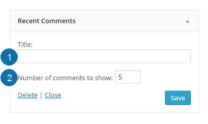
- Title: The title you wish to display, such as Recent Comments.
- Number of comments to show: The number of comment links you wish to display.
Once you have completed the widget configuration, be sure to click Save at the bottom of the widget to preserve your settings.
Tag Cloud Widget Settings
The Tag Cloud widget is used to display a list of all the tags or categories that have been assigned to your posts. It can be used in any widgeted area, such as a sidebar or a footer.
To add the widget to a widget area, go to Appearance > Widgets, click on the Tag Cloud widget title bar, select the desired widget area from the list, and click Add Widget.
To configure the widget, click the title bar to open it, and change the settings to the following:
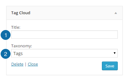
- Title: The title you wish to display, such as Tags.
- Taxonomy: Choose whether to display Tags or Categories.
Once you have completed the widget configuration, be sure to click Save at the bottom of the widget to preserve your settings.
Text Widget Settings
The Text widget is used to display information about a particular service, contact information, or a lead-in to your About page. It can be used in any widgeted area, such as a sidebar or a footer.
The theme demo uses theme-specific sample content in this text widget, but you can use your own title, and include whatever information you like.
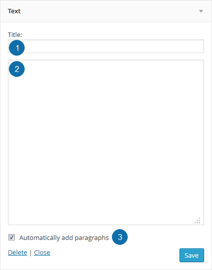
- Title: Your desired title. This is optional – you can just add content and leave the title blank, if you wish.
- Content: Add your desired content to the content box.
- Automatically add paragraphs: Check this box if you have multiple paragraph content, and wish to have paragraph tags added to format the content properly.
Once you are done entering your content, be sure to click Save at the bottom of the widget to preserve your changes.
Blog Page Template
The Blog Page Template can be used to create a page to display your posts.
To use the template, create a new page in your WordPress admin. You may call it Blog, or use a different title, such asNews.
Content entered into the page editor will not display on the page.
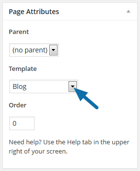
On the page edit screen, select the Blog template from the drop down in the Page Attributes box in the right sidebar, then click Publish.
Next, go to Genesis > Theme Settings > Blog Page Template, and configure the content you wish to display on this page.

- You may choose to display All Categories, or a single category, using the drop down.
- You may choose to exclude one or more categories by including the category IDs in the input field.
- You may also choose how many posts you wish to display on this page. Note: This setting is different from the Blog pages show at most setting on Settings > Reading.
Once you have completed your configuration, make sure you click Save Settings at the bottom of the page to preserve your changes.
You may wish to add a link to this page in your navigation menu so your site visitors can find it.
Archive Page Template
The Archive Page Template is used to create a page to display a list of your site pages and your post archives by category, month, author, and recent posts.
To use the template, create a new page in your WordPress admin. You may call it Archive, or any title you wish.
Content entered into the page editor will not display on the page.
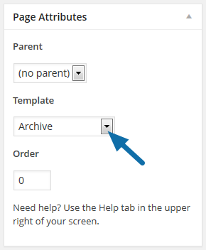
On the page edit screen, select the Archive template from the drop down in the Page Attributes box in the right sidebar, then click Publish.
You may wish to add a link to this page in your navigation menu so your site visitors can find it.
Landing Page Template
The Landing Page Template is used to create a full-width landing page with no header image or navigation.
To use the template, create a new page in your WordPress admin. You can enter any title you wish and enter your desired content into the page editor.
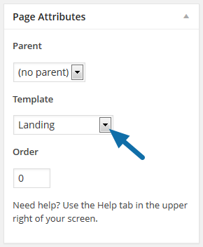
On the page edit screen, select the Landing template from the drop down in the Page Attributes box in the right sidebar, then click Publish.
You may wish to add a link to this page in your navigation menu so your site visitors can find it.
Page Excerpts
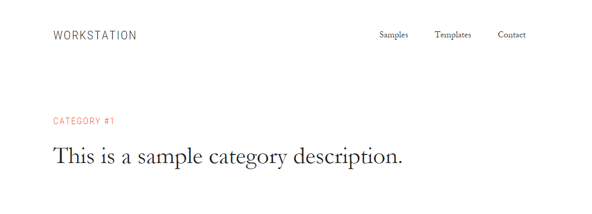
The Workstation Pro theme includes the optional display of excerpts at the top of pages.
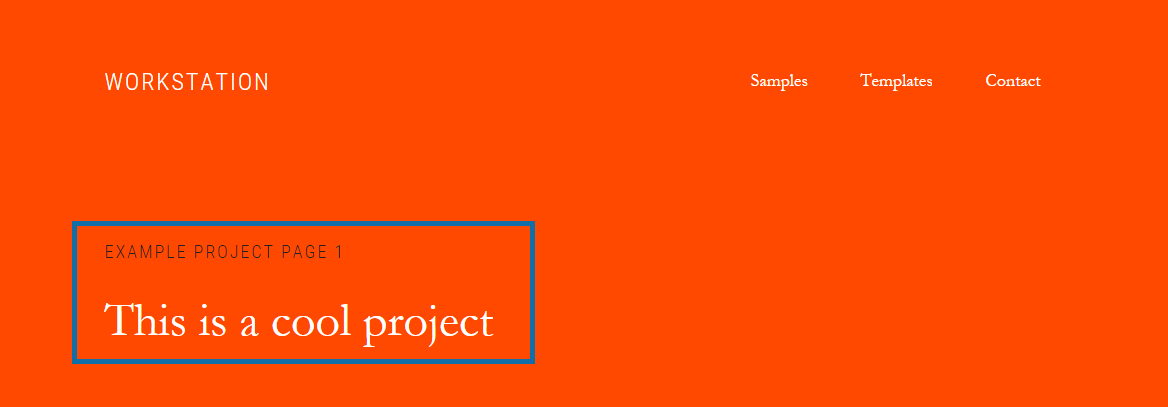
The above example can be viewed here: Example Project Page 1.
Start by going to Pages > Add New to create a new page or Pages > View All to edit an existing page. On the page editor screen, click the Screen Options tab in the upper corner of the screen.
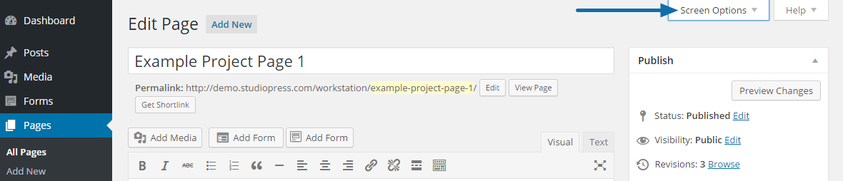
Check the box to enable Excerpts.
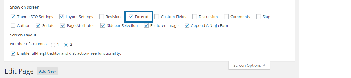
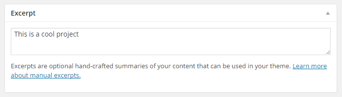
Scroll down to the Excerpt section and enter your desired page excerpt.
Be sure to click Publish or Update to preserve your settings.
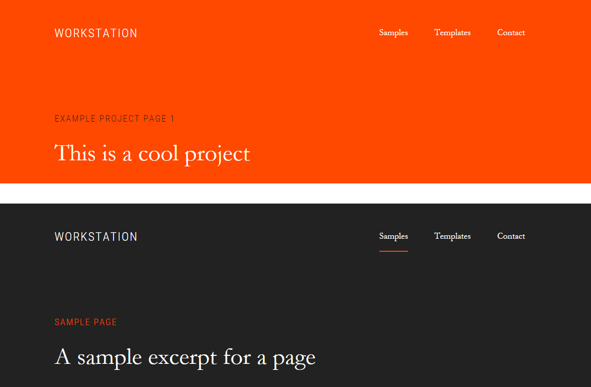
Background Color for Site Header and Page Excerpt Area
The Workstation Pro theme includes optional background colors for the site header and page excerpt area.
By default, this area uses a white background:
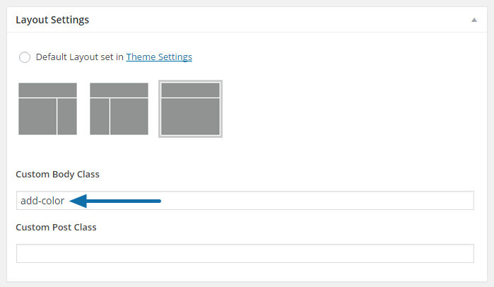
You can change the background to orange or black by adding a custom body class.
Start by going to Pages > Add New to create a new page or Pages > View All to edit an existing page.
On the page editor screen, scroll down to the Layout Settings section and add the desired body class in the Custom Body Class field.
- To add the orange background color: type add-color
- To add the black background color: type add-black
Note: When using add-color, you can change the orange to a color of your choice in the customizer’s Color Settings. Go to Appearance > Colors and change the Accent color to your preferred color.
Be sure to click Publish or Update to preserve your settings.
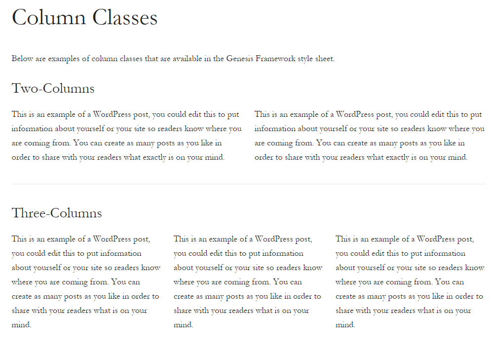
Column Classes
The following image demonstrates how column based content can be displayed on your site.
This type of structured content may be used in posts, pages and inside text widgets to structure content often seen in a welcome message or a call to action banner.
 English